windows app
What's_
ON
Mobile App Product design

problem statement
Summary
Gracenote is the world’s leading entertainment data and technology company with services like EPG (Electronic Program Guide) and TV programs listing.
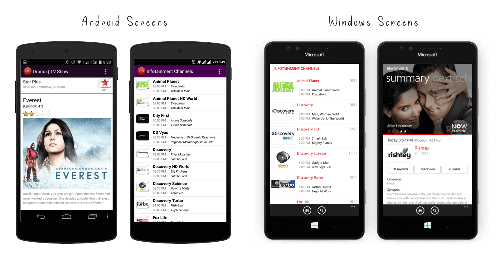
What's ON is their product/App which allows users to Quickly see what’s on TV, mark your favorite channels & shows, set reminders, and discover new shows.
But they wasn't doing so great with Windows Mobile App (Actually older App was a direct replica of their Android version)!
Involvement
As a lead on this project, my involvement consisted of overseeing the entire product design from initial information architecture to continuous development. Beyond the product mapping, prototyping and user-testing, I also sanitized current Android and iOS UI components.
- Workflows
- Wire-framing
- Lead designer
- Built UI Library
the process
Approach
It's not another redesign!
Being a fast growing company, we had increasing problem of inconsistency. Layouts were built by different people with different focus areas. Things worked out well for each screen/project/functionality, but it was never a unit.
So for me, this project is not another redesign. It's about stetting a standard and creating base for our design and development team.
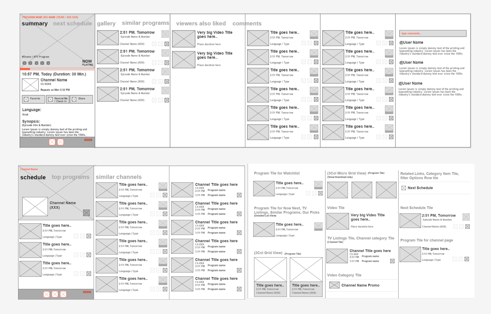
Keeping it native
Sticking to native UI components was the ground rule of this project. This helped us speed up our development process and was also no learning curve for users.
Design increased installs by 8%!
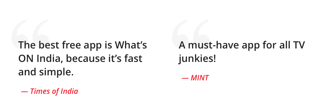
'Redesign' project showed us why design is important. All those tiny icons and spacing matters. Here are some mentions of "What's ON" in news.
