dashboard
Loan_
Lookup
Website Product design

problem statement
Summary
Capital Float needed an easy and scalable solution for their workforce to see how transaction are applied to an expectation (installment)
Operations, Sales, Customer Support team, everyone had to juggle between 2 separate views to reconcile transaction data against expectations.
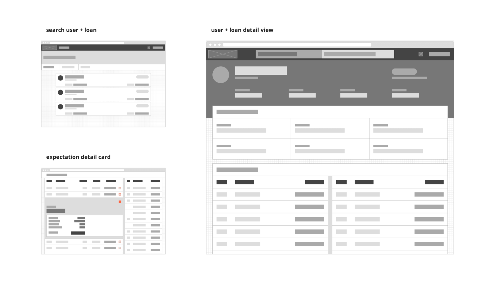
The Loan Lookup created a central place for transaction and installments giving users the ability to easily map transaction to expectations and vice versa. Now users can easily search for a loan or borrower from single place and check the status of each loan.
Involvement
My involvement consisted of being the sole designer, overseeing the entire product design. This included the creation of wireframes, product maps, prototypes.
- Workflows
- Wire-framing
- Sole designer
- Atomic design
the process
Approach
Unifying transaction and expectation into one central system.
Through observing how users interact with current system, areas which could be improved became apparent. After wire-framing, it was tested out with users.
The core feature was the ability to give incremental content as per need or based on context. If user is viewing transactions, then show him/her only transaction details in expanded view. Other features include ability to link transaction to installments and vice versa.

The dashboard was built to make the process of reconciliation as efficient as possible. Also the ability to search loan with multiple parameters and also by traversing from borrower, made the workflow obvious and easy.
Responsive, scalable and fast. An application built for efficiency.
Capital Float currently handles 1,000+ loans and 20,000+ transactions per day and their operations team had great feedback - all of this wouldn't have been possible without constant user research, user conversations and testing of the interface to make sure all type of users understand the shown data.


