data visualization
Data_
Pipeline
Web App Product design
problem statement
Summary
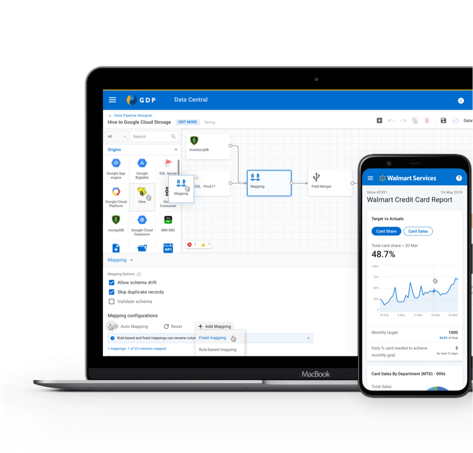
Data Pipeline is a visual data management tool which allows Data Engineers to process data and generate insights.
Walmart has 25+ data sources/targets and thus needs to hire engineers with specific skills for data acquisition, process and load. Data Engineers who specialise in a particular domain have to spend the majority of their time in infrastructure setup and data acquisition rather than building insights / generating reports.
With the Data Pipeline, we are trying to build a self-serve, user interface-driven data management platform which provides an end-to-end solution for Data Acquisition, Processing and Load.
My involvement & Collaboration
This project started as a Proof of Concept (POC) with a team of 10 engineers, 2 Product Managers and me as sole UX Designer. During the first six months, I was playing the role of UX Researcher, Designer and a Visual Designer. Later our team grew exponentially. I was acting as a UX Lead with 2 UX Designers and a cross-functional team of 30 engineers!
This project allowed me to play the role of mentor and also learn how to collaborate with PMs and Developers.
- UX Researcher
- Sole designer to UX Lead
the process
Approach
Building a self-serve, user interface-driven data management platform which provides an end-to-end solution for Data Acquisition, Processing and Load.
Data at inception
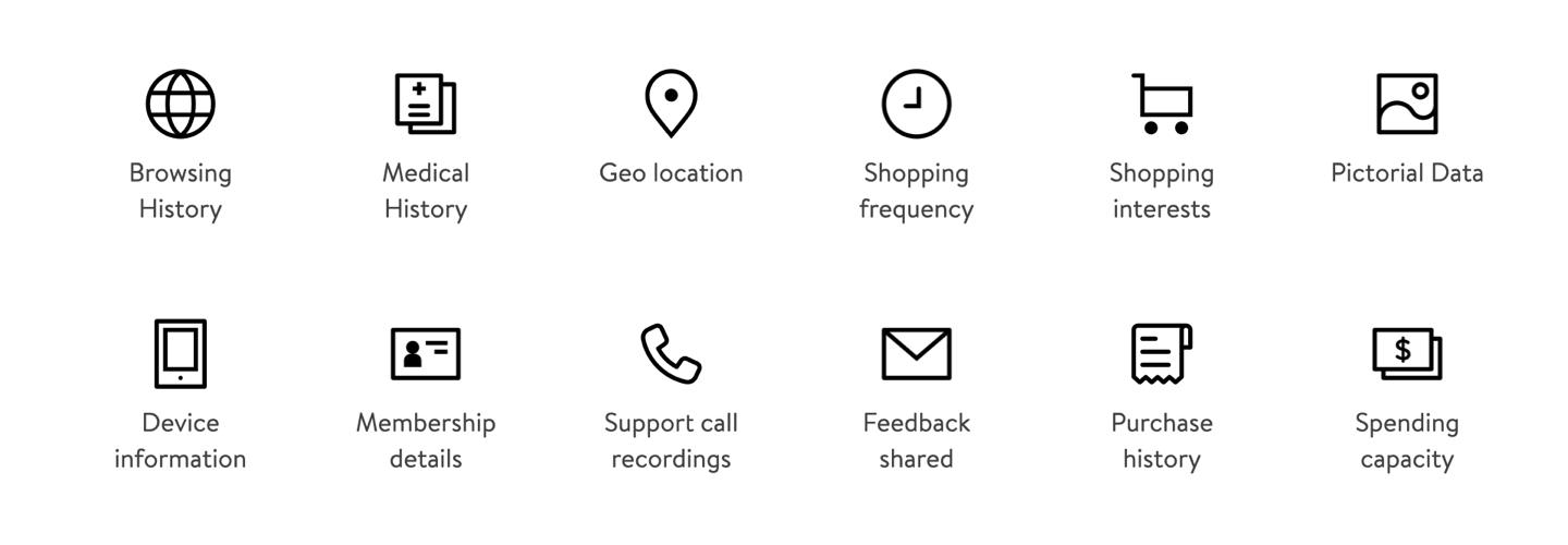
Before we get into the objective of the project and the process, let's understand the journey of data to insight (Data Lifecycle).
Data Lifecycle
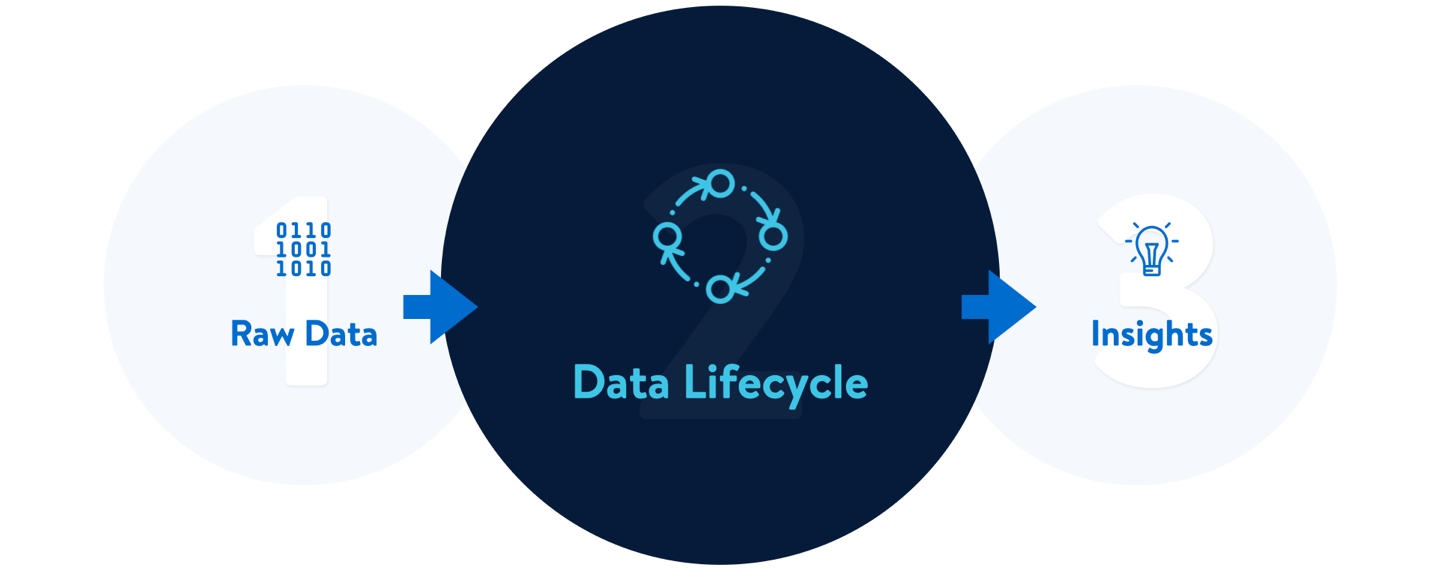
Data Engineers need to perform a series of operations to gain insights from raw-data. Below are the steps of a Data Lifecycle
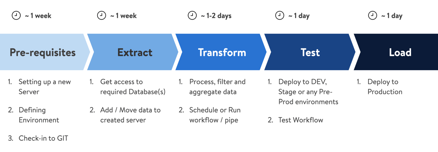
Data Engineers use 10+ tools to write code, debug, version control, database infrastructure and not to mention wait time for getting resources and approvals. This was affecting efficiency and becoming a reason for frustration. It was the main reason to get started on "Data Pipeline" and became the NorthStar.
Secondary research
After our initial requirement discussion and project kickoff-meeting, we started with our desk research.
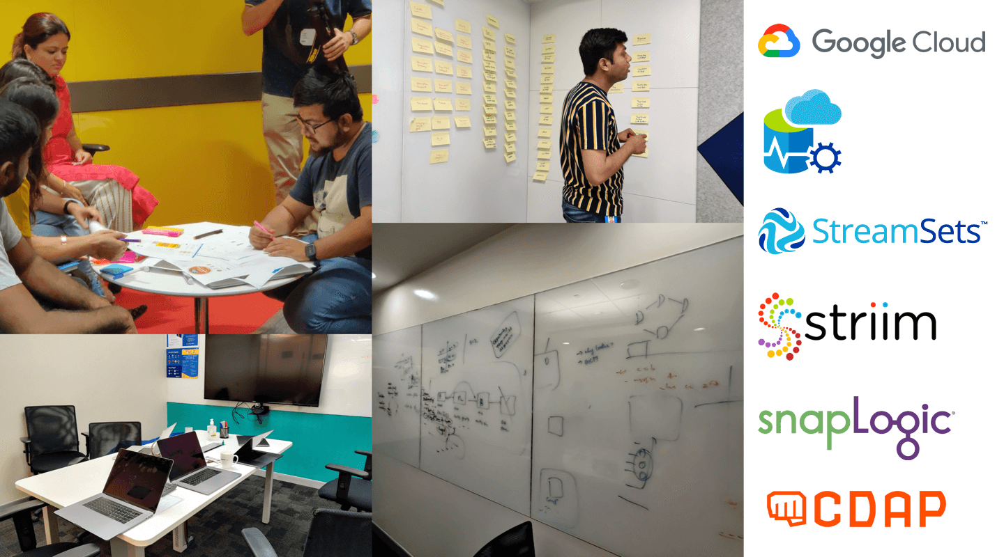
We interviewed Data Engineers to understand their day-to-day activities and which tools they use. We also did a user shadowing to observe and note their behaviours and frustrations.
We also did competitive research to see how different tools are solving problems and what are the industry best practices.
Initial approach
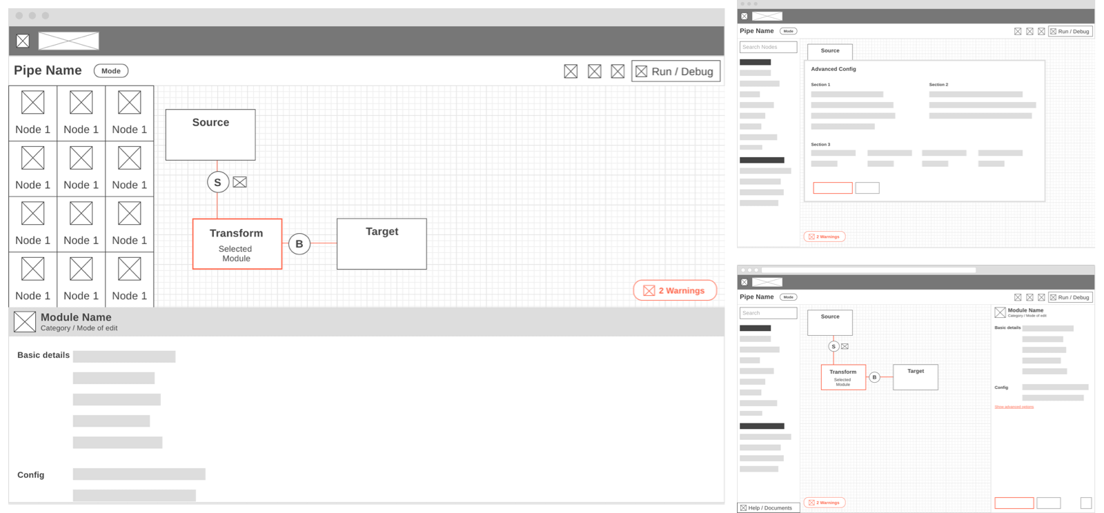
Our initial idea was to define the core components of the Data Pipeline and understand how are they linked to each other. Are there any dependencies among modules? Do they work sequentially or in parallel? Are they independent? Below are the core modules of the Data Pipeline and a template of a generic pipe.
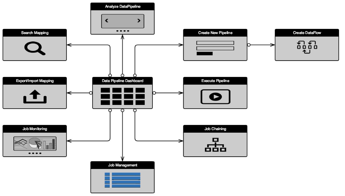
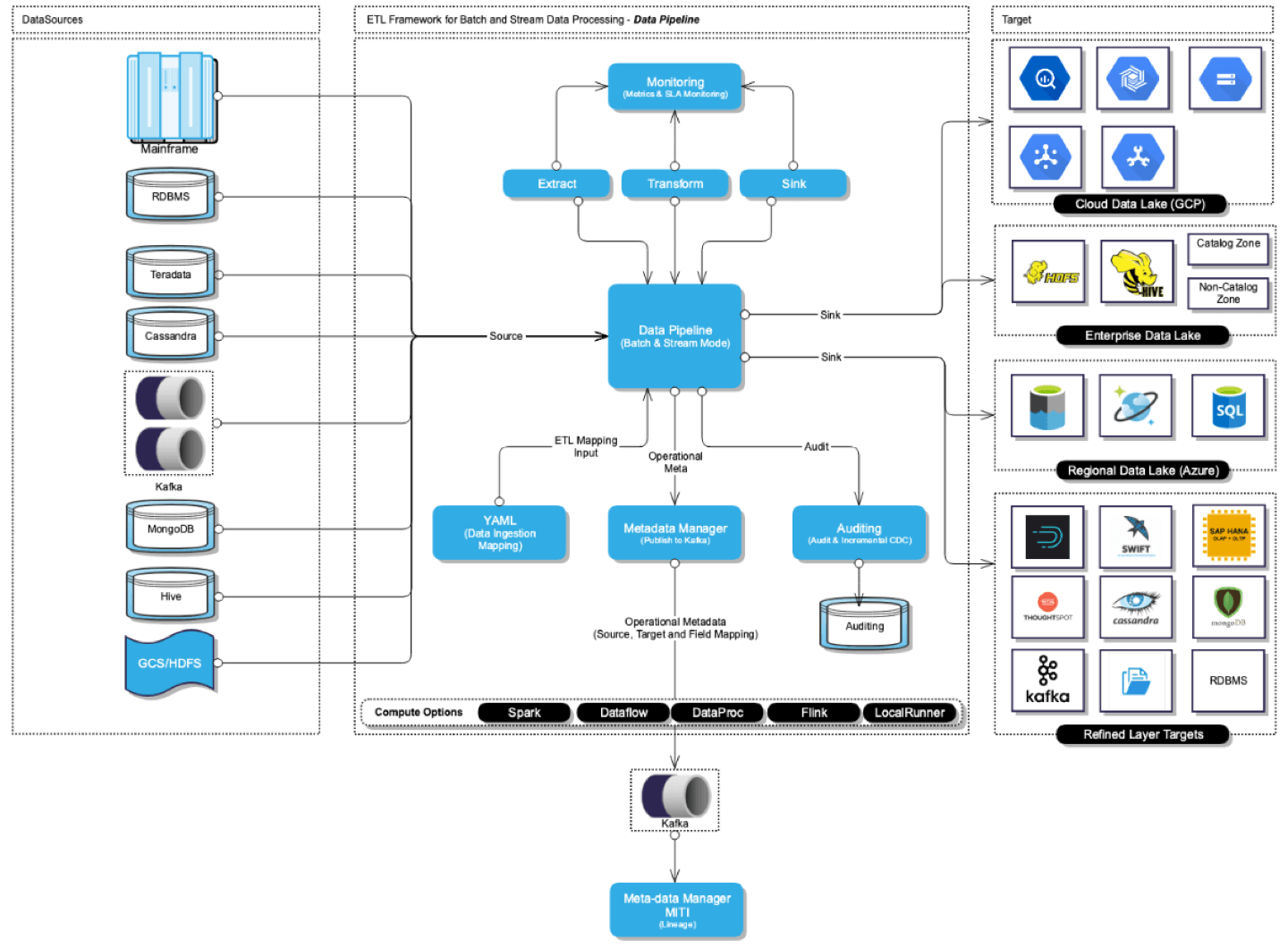
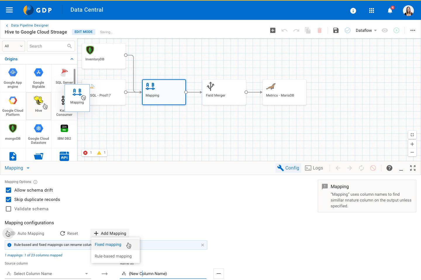
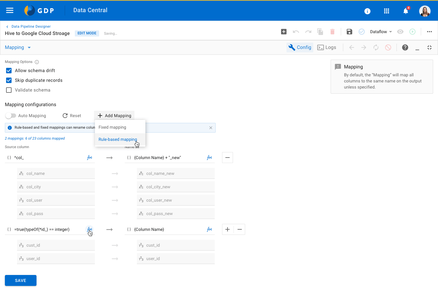
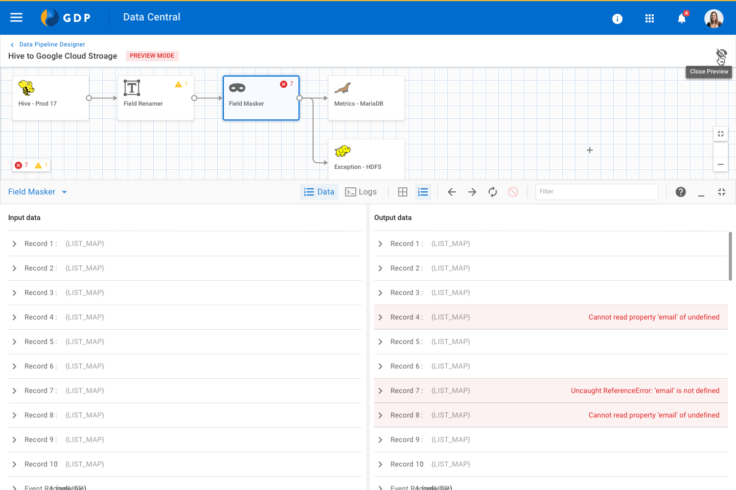
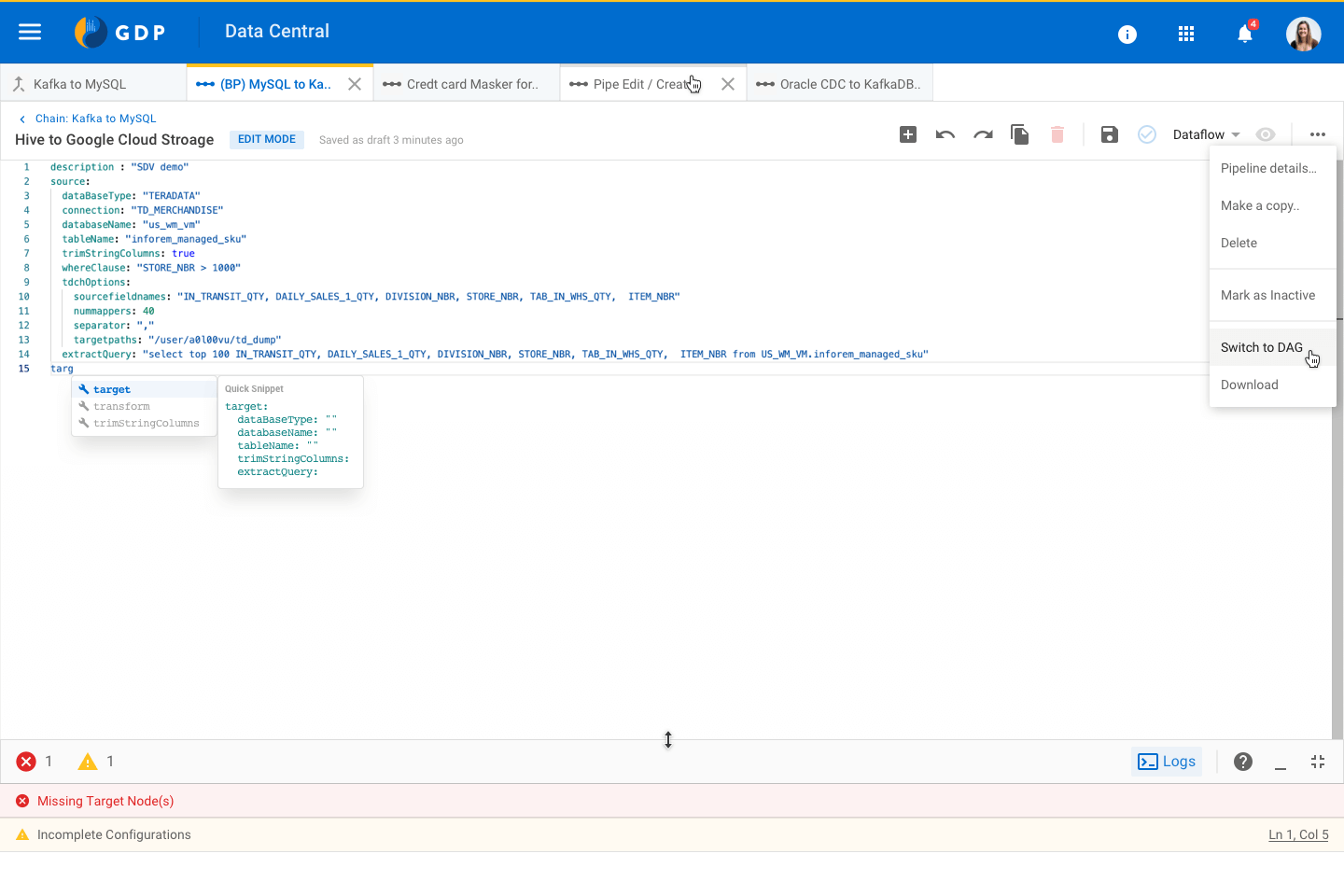
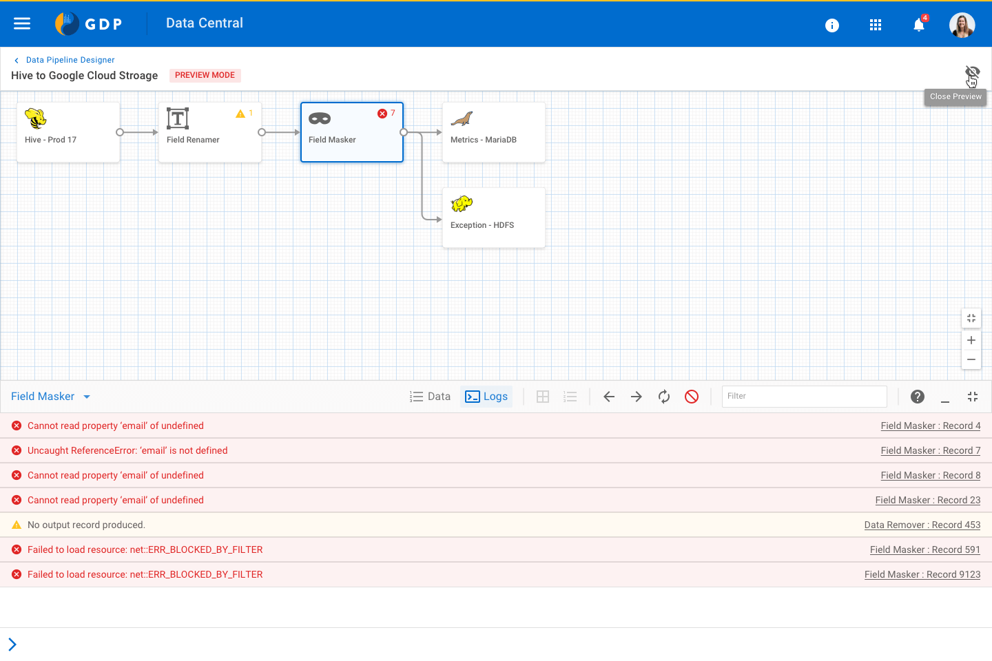
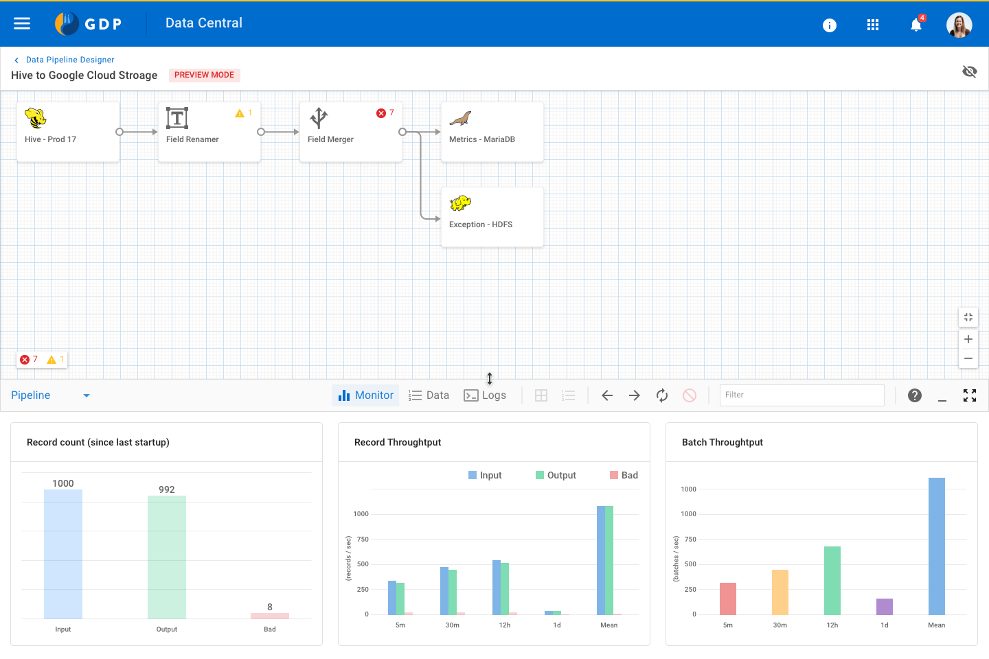
As a UX designer, to answer all these questions and identifying patterns was crucial to creating wireframes of core layouts. Canvas or a designer screen is the heart of the Data Pipeline. We tried multiple layout options so that it fits the requirements of our 55+ different nodes.
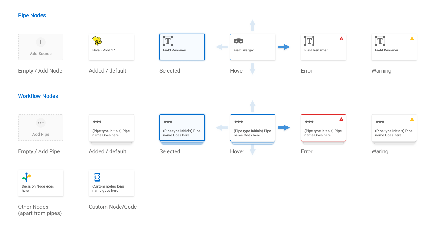
Nodes and connectors' design and micro-interaction played a decisive role in defining the experience for canvas designer.

UX Success Criteria
Expectations:
Does the design meet the user's mental model?
Discoverability:
Do users notice available features? Do they take the right actions?
Understanding:
Are users able to associate their actions with the outcome?
Feedback:
Does the system provide guidance or feedback for the user's actions?
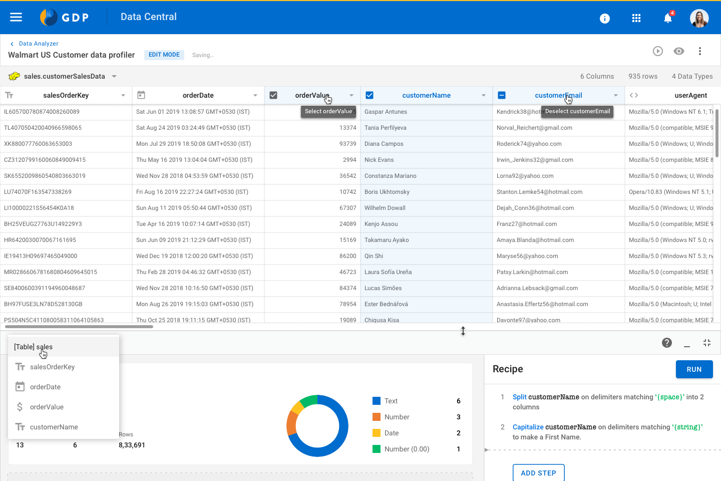
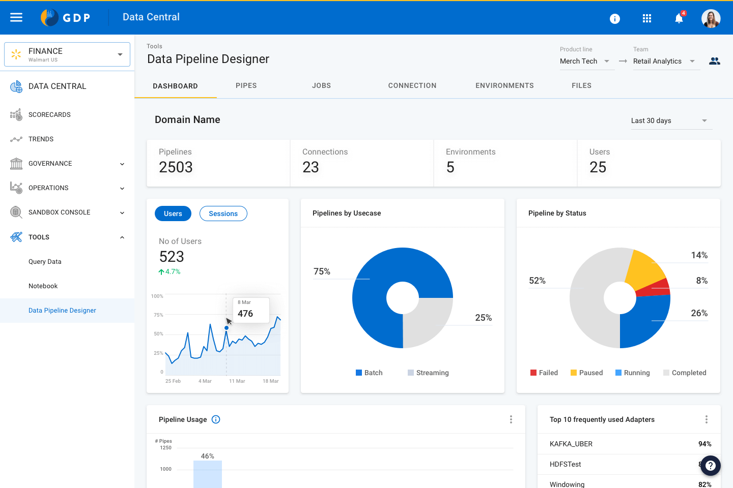
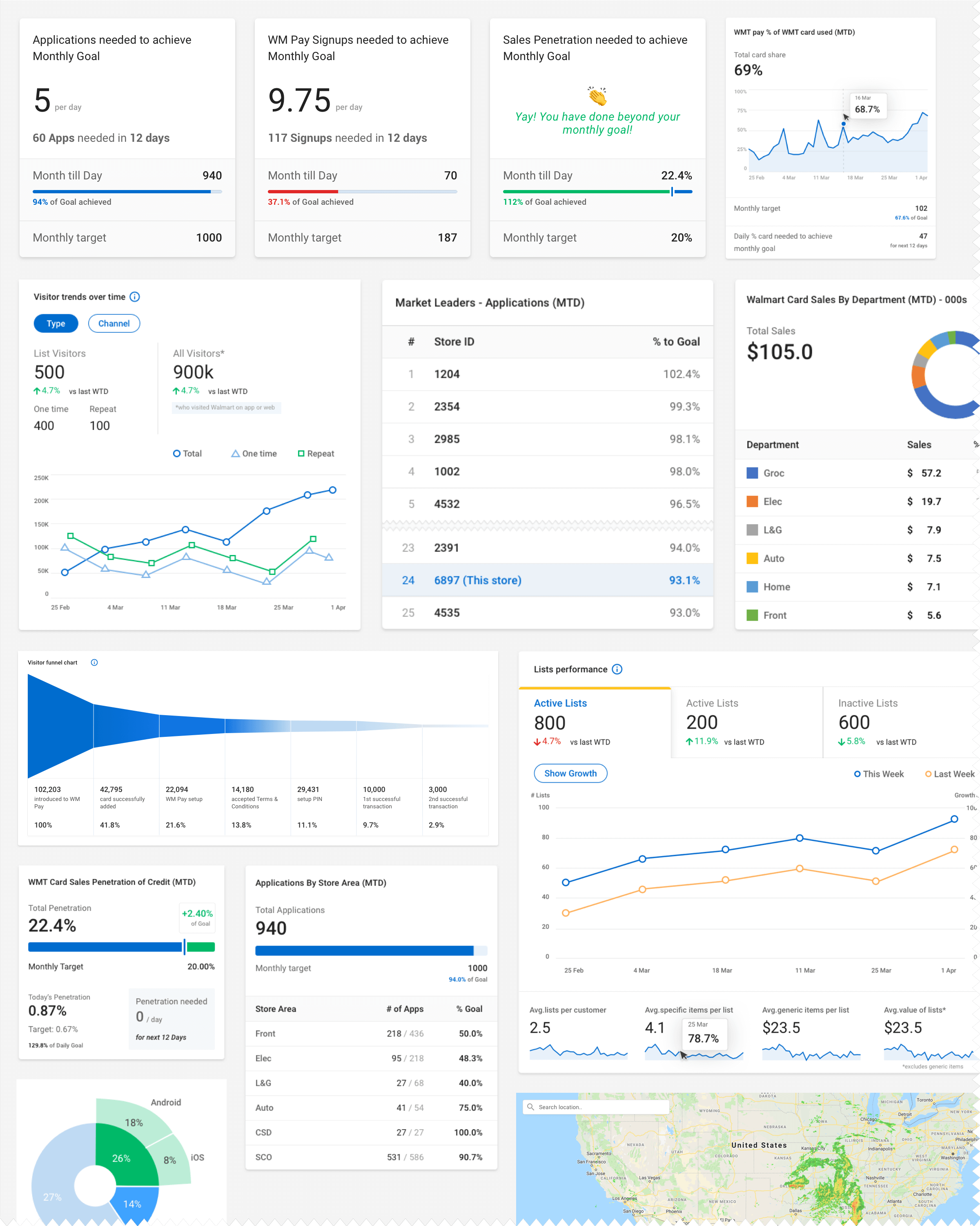
Along with Data processing, Data Pipeline also offers Data Analysis and Visualisation features. Below are a few data widgets we have created to meet the needs of Business Analysts.
Product Impact
Self-serve, User interface driven data management platform. Built for efficiency and adaptability.
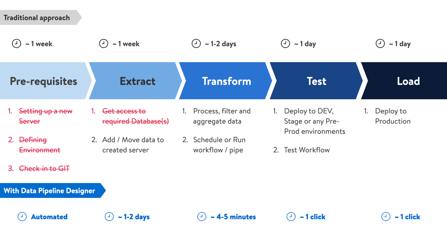
Data Pipeline project began with the goal of bringing efficiency in Data Engineers day to day work. And we were able to make significant improvement by eliminating repetitive tasks and allowing users to work with all types of data with user-interface.
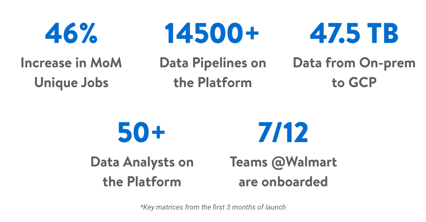
Along with efficiency, we were also able to bring more adaptability to the platform. As this is a user-interface driven tool, even business analysts and Data Engineers were able to use the data and generate useful insights. These are a few Key matrices captured from the first 3 months of launch.
